Godfather beer: an opposition they couldn’t refuse?

A recent UK trade mark opposition raises interesting questions about the extent to which a well-known word mark, in stylised script, can be relied upon to claim similarity (and thereby prevent registration) of a later mark.
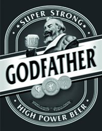
Devans Modern Breweries Ltd applied for the mark below for “beer”:
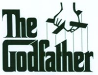
Paramount Pictures Corporation opposed the application relying on the marks below, both registered in class 43 and including “bar services”; the mark on the left also included “beer”:

Paramount seemingly had a strong case: all its marks were within the five-year grace period for non-use; identical/extremely similar goods/services were covered; and the application featured, as arguably its most dominant element, an almost identical word.
However, Paramount only relied on Section 5(2)(b) of the Act, meaning that any reputation in THE GODFATHER marks should not be taken into account. In fact, neither party filed any evidence, and there was no hearing. Only written submissions were presented.
Unsurprisingly, the hearing officer held that the goods/services were identical or similar. Given their subject matter, he also held that the relevant average consumer was a member of the adult general public with an average level of attention; and that the selection process for the goods/services would be primarily visual (though aural considerations would also play their part).
When comparing the marks, he acknowledged that he should not artificially dissect the marks but consider their distinctive and dominant elements. He felt that the various additional elements in the application (the non-distinctive words SUPER STRONG and HIGH POWER BEER; the stars, oval, decorative banner, three roundel logos) made little if any contribution to its overall impression.
As regards the “bearded gentleman drinking a frothy beer” and the word GODFATHER, he held that rather than being “highly distinctive”, an image of a person enjoying the goods at issue was fairly common in such labels. He found that the word GODFATHER, given its size and positioning in the context of the mark as a whole, would make by far the greatest contribution to the overall impression conveyed. The hearing officer found that the opponent’s marks clearly comprised what the average consumer would perceive to be the word GODFATHER after the word THE, noting that the puppeteer device in the first mark would not affect that analysis.
Overall the application was deemed to have no more than a medium degree of visual similarity with the earlier marks; a very high degree of aural similarity; and a high degree of conceptual similarity.
The hearing officer noted that it would be unrealistic of him not to agree with the applicant that Paramount’s marks would, for a not insignificant number of consumers, remind them of the well-known film trilogy of the same name. Nevertheless, he rejected the applicant’s argument that that was sufficient for a finding of conceptual dissimilarity and found that there was a likelihood of both direct and indirect confusion. The opposition was successful.
Comment
The Times ran an article on book covers earlier in the year (2017), in which a font designer described how typefaces influence consumers and act as signposts:
Once a logo has become familiar you no longer even need to read the words to know what they say, because you recognise it by its shape.
We do this from a young age. The designer gave the example of a friend’s daughter, a four year old who believes her family’s car is made by the well-known UK pharmacy BOOTS on the basis of its logo. Bearing in mind the BOOTS logo (below left), once can see why the girl made a link with the well-known FORD logo (below right), despite the marks sharing no tenable similarities in their verbal elements.
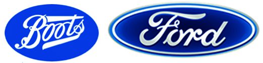
Even a four year old recognises the similar fonts and colour schemes used in these marks, and makes assumptions and links accordingly. It seems likely that an adult consumer (admittedly one familiar with THE GODFATHER films, though the hearing officer noted that there were a not insignificant number of these) would be extremely familiar with the gothic-style font of Paramount’s marks, and expect to see that font replicated in any beer or bar services offered under the marks. There is a reason why Paramount filed for the mark in the stylised format. It could have elected to file a plain word mark, but did not do so.
In such circumstances, although this decision is undoubtedly correct, one cannot help but feel a little sympathy for the applicant, particularly when a UK designation of an international trade mark for THE GODFATHER (in the name of an entity apparently unconnected to either party here) has registered for “beer” in class 32 for some years.
Case details at a glance
Jurisdiction: UKIPO
Decision level: Opposition
Parties: Devans Modern Breweries Limited v Paramount Pictures Corporation
Citation: O-548-17
Date: 31 October 2017
Full decision (UKIPO PDF): www.ipo.gov.uk