Coffee on the rocks: Starbucks v Coffee Rocks
Whilst not making new law, the decision from the General Court to overturn the rejection of Starbucks’ opposition to the COFFEE ROCKS mark raises some interesting points for discussion.
Whilst not making new law, the decision from the General Court to overturn the rejection of Starbucks’ opposition to the COFFEE ROCKS mark show below raises some interesting points for discussion.

The COFFEE ROCKS mark
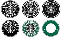
The Starbucks marks
First, it will act as a warning to new businesses who decide to adopt a logo that shares similar features with a well known and established brand that, even when replacing the distinctive elements, this will not necessarily mean they have done enough to escape the wrath of (or a successful opposition by) the well-established business.
Second, might the General Court’s decision be placing the EU Trade Mark Office, the EUIPO, in a difficult position when balancing what is enforceable against what can be registered as a trade mark?
The application to register the COFFEE ROCKS logo was filed in 2013. Starbucks opposed but were unsuccessful both before the Opposition Division and then the Board of Appeal. The Board of Appeal reached the conclusion that Starbucks had failed to overcome the first hurdle, namely to establish that there was any degree of similarity whatsoever between the marks. As a result, Starbucks’ two grounds before the General Court were:
- that there was some similarity between the marks (and enough to establish a likelihood of confusion); and
- the question of its reputation in its logo had not been considered by the Board of Appeal at all.
In comparing the marks the court noted according to case-law, two marks are similar when, from the point of view of the relevant public, they are at least partially identical as regards one or more relevant aspects. Although the Board of Appeal had concluded the marks were visually, phonetically and conceptually dissimilar, the court took issue with the first of these. Starbucks argued, and the court accepted, that there was the same overall general appearance between the marks and use of the same font. Starbucks also drew the court’s attention to the fact that the mark applied for could be used in the colour combination covered by their earlier registrations thereby increasing the degree of similarity. Interestingly, the EUIPO acknowledged this at the hearing; however, one wonders if the same degree of similarity would have been found if the subject application had been filed in orange and black, the colours used by the applicant.
The court overruled the Board of Appeal who had effectively held that the similarity between the less distinctive components of the earlier marks and the mark applied for was negligible in the overall impression which those marks made on the relevant public. As a result, the court concluded that the Board of Appeal was wrong to hold that the marks were dissimilar, ruling out any possibility of similarity, even to a low degree.
Having persuaded the court that there was at least some degree of similarity between the marks Starbucks argued that their reputation had not been considered by the Board of Appeal and that this would be decisive in determining whether a conflict might arise between the marks. Starbucks needed to show that the three relevant conditions had been met: first, that the signs at issue are identical or similar, secondly, that their earlier mark(s) had a reputation and, thirdly, that there is a risk that the use by someone, without due cause, of the sign in respect of which registration as a trade mark is applied for would take unfair advantage of, or be detrimental to, the distinctive character or the repute of the earlier mark.
The court held the similarity between the logos was capable of leading the relevant public to make a connection, that is to say, to establish a link between them and that, once again, the Board of Appeal had failed to consider this aspect of the case sufficiently.
Therefore the court annulled the Board of Appeal’s decision and awarded costs in favour of Starbucks. The court may have remitted the case back to the Board of Appeal for further consideration – it is not yet clear from the public record. Alternatively, it simply chose to overturn the rejection of Starbucks opposition with the result that, absent a further appeal to the Court of Justice, the application will be rejected.
The case highlights the risks involved in adopting a mark that mimics or too closely resembles a well known brand even, for a logo, in relation to the less dominant elements.
Following this case there has been further discussion regarding the breadth of protection afforded to Starbucks.
Does this now prevent any third party from using two concentric circles with the word COFFEE to offer coffee related services? Also, although protection was obtained in Spain for the last of the 6 marks shown above in green, would the EUIPO accept an application for such a mark in black and white? In short has the Court concluded with this decision that Starbucks has rights in various elements of their logo which they can assert successfully against a third party but which they might have some trouble in protecting if they were to seek registration before the EUIPO. The EUIPO’s position regarding composite marks without any distinctive dominant element is relatively strict and often applications are refused. It would be interesting to see how Starbucks fares.
Case details at a glance
Jurisdiction: European Union
Decision level: General Court
Parties: Starbucks Corp, EUIPO, Hasmik Nersesyan
Date: 16 January 2018
Citation: T‑398/16
Full decision (curia link): http://curia.europa.eu
